BODEGAS DE SANTO TOMÁS

REBRANDING

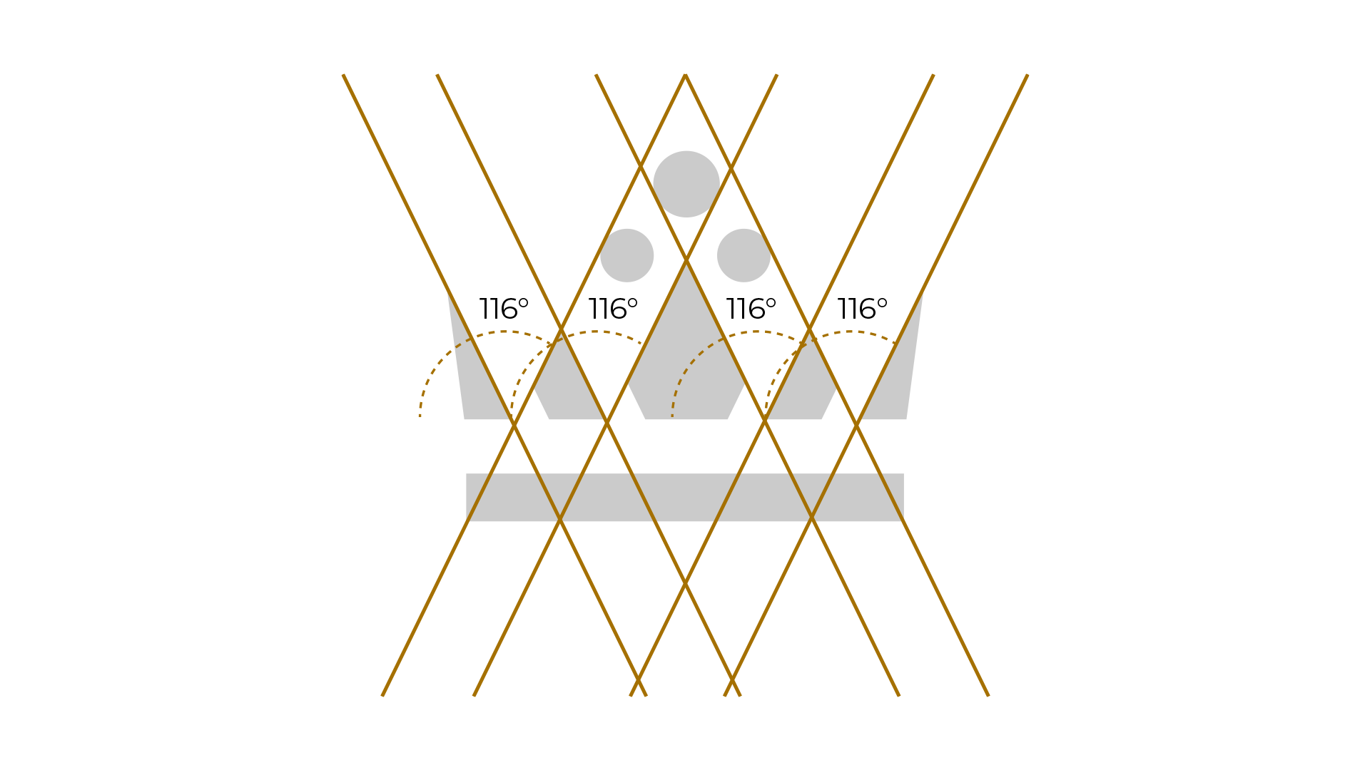
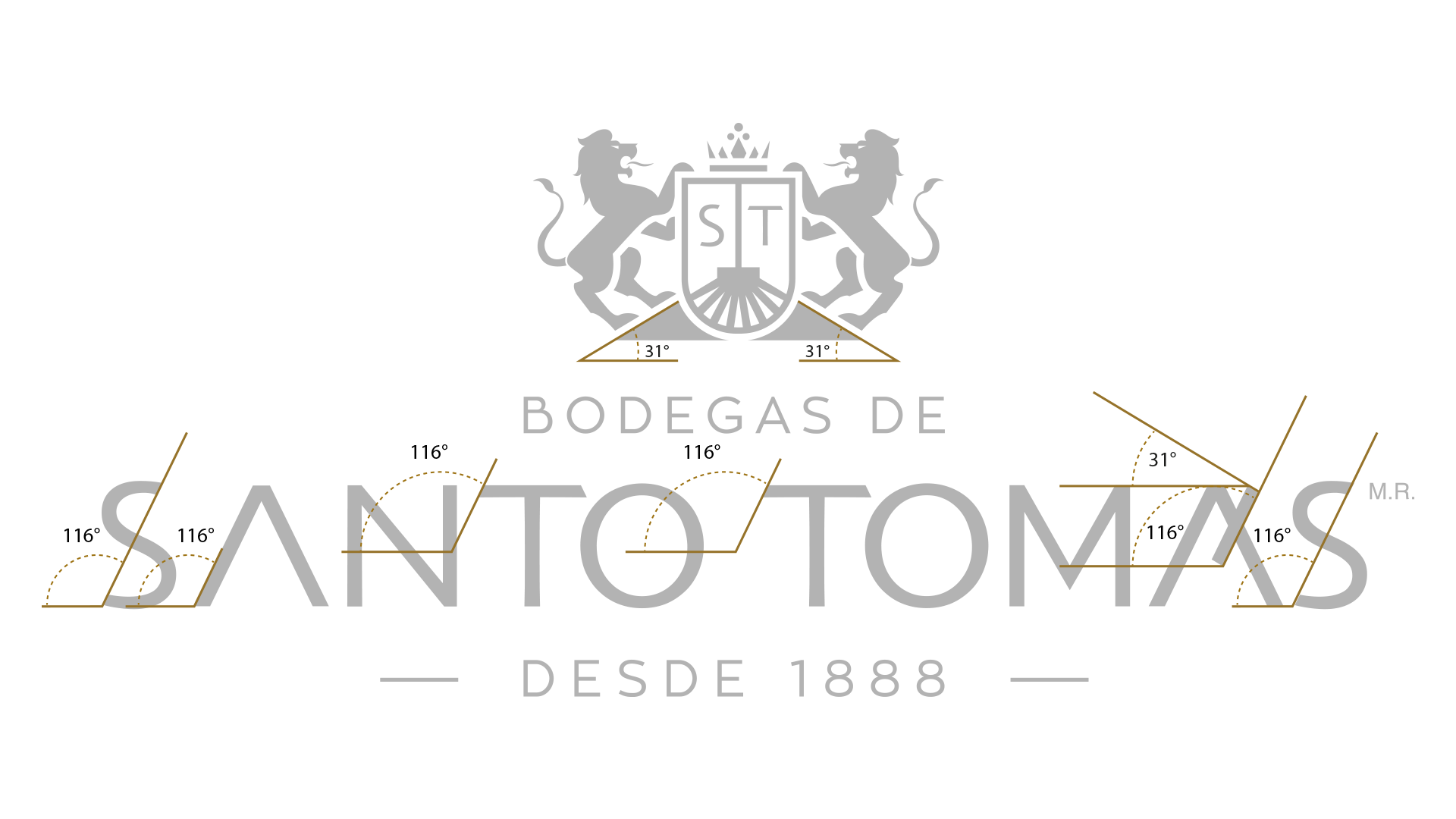
In a category where 80% of purchase decisions are made in front of the shelf, we took on the task of redesigning the logo of Bodegas de Santo Tomás, the oldest winery in Baja California. And to achieve this, we paid tribute to what makes its wines unique: the geographical location of its valley.

Through a graphic dogma, we traced the coordinates of the valley to create the angles of the logo’s elements.

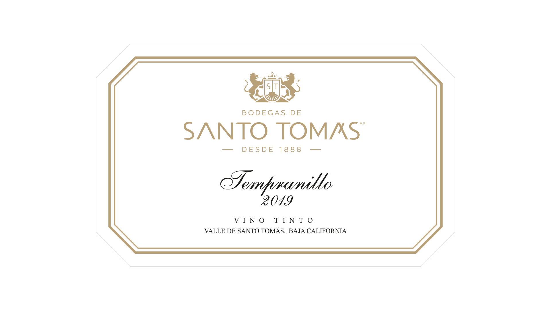
Today, Bodegas de Santo Tomás’ pride in its place of origin lives on the inside and outside of its bottles.

RELATED PROJECTS

BRAND ARCHITECTURE

LÍNEA MÉXICO REDESIGN

In the midst of a pandemic, more than redesigning a label, we pay tribute to the value of Mexicans.

BRAND ARCHITECTURE

CORNELIA

Full of color and representative textures of Mexico, this is the image we developed for a brand that honors the gastronomy of Mexico.

Compártenos en:

WhatsApp
Messenger
LinkedIn

360 CAMPAIGNS

LÍNEA MÉXICO REDESIGN

In the midst of a pandemic, more than redesigning a label, we pay tribute to the value of Mexicans.

BRAND ARCHITECTURE

CORNELIA

Full of color and representative textures of Mexico, this is the image we developed for a brand that honors the gastronomy of Mexico.